
Reflecting calm, focus, and the soothing essence of lo-fi music. The goal was to build a visual language that feels inviting, serene, and memorable.
The challenge was to capture the mood and emotional impact of lo-fi music in a visual identity while making it appealing to a wide audience, from casual listeners to dedicated enthusiasts.
I began by exploring visual moods, color palettes, and typography that evoke calm and flow. Through iterative sketches and mood boards, I refined the aesthetic until it conveyed the serenity and subtle energy of the music.
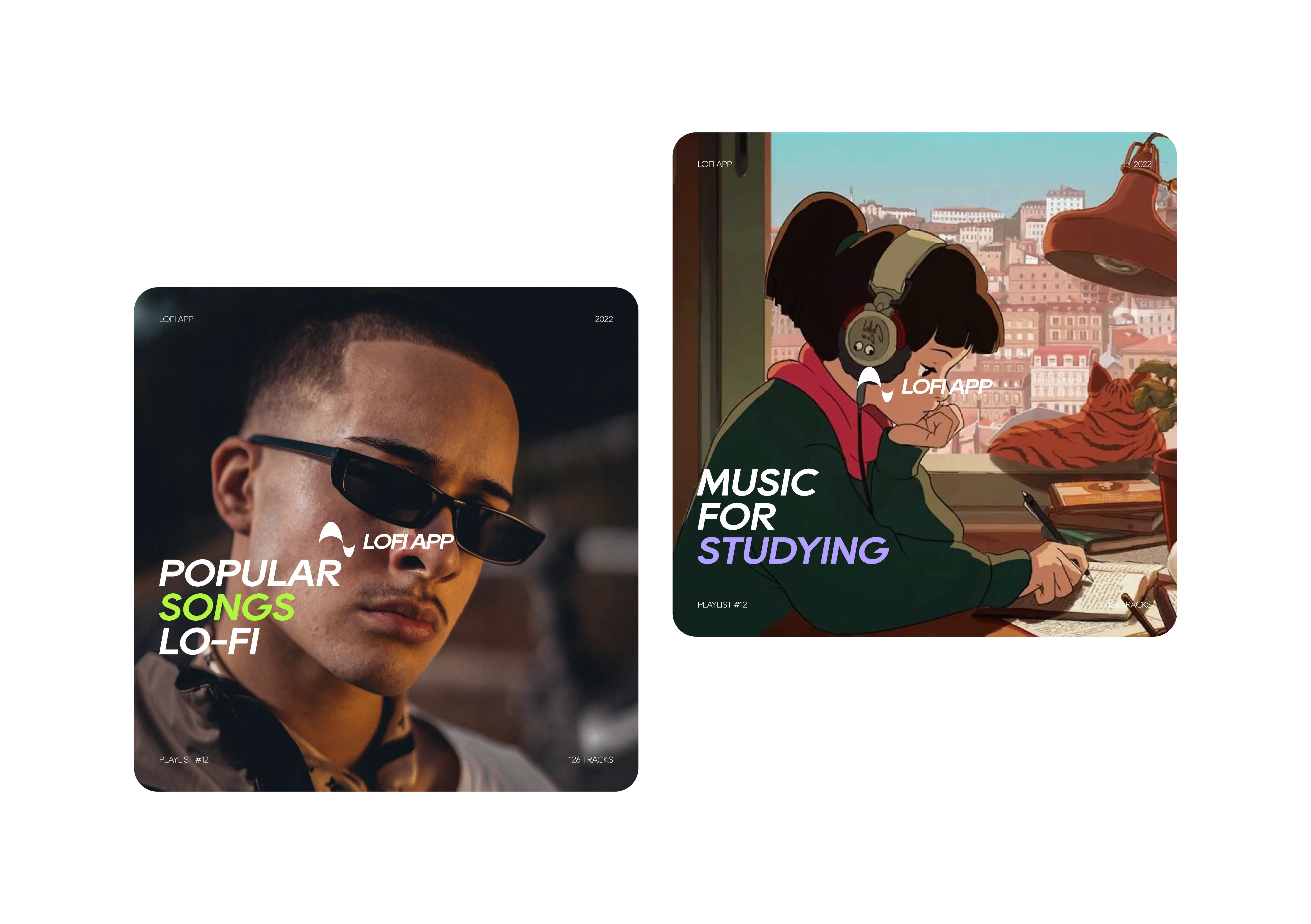
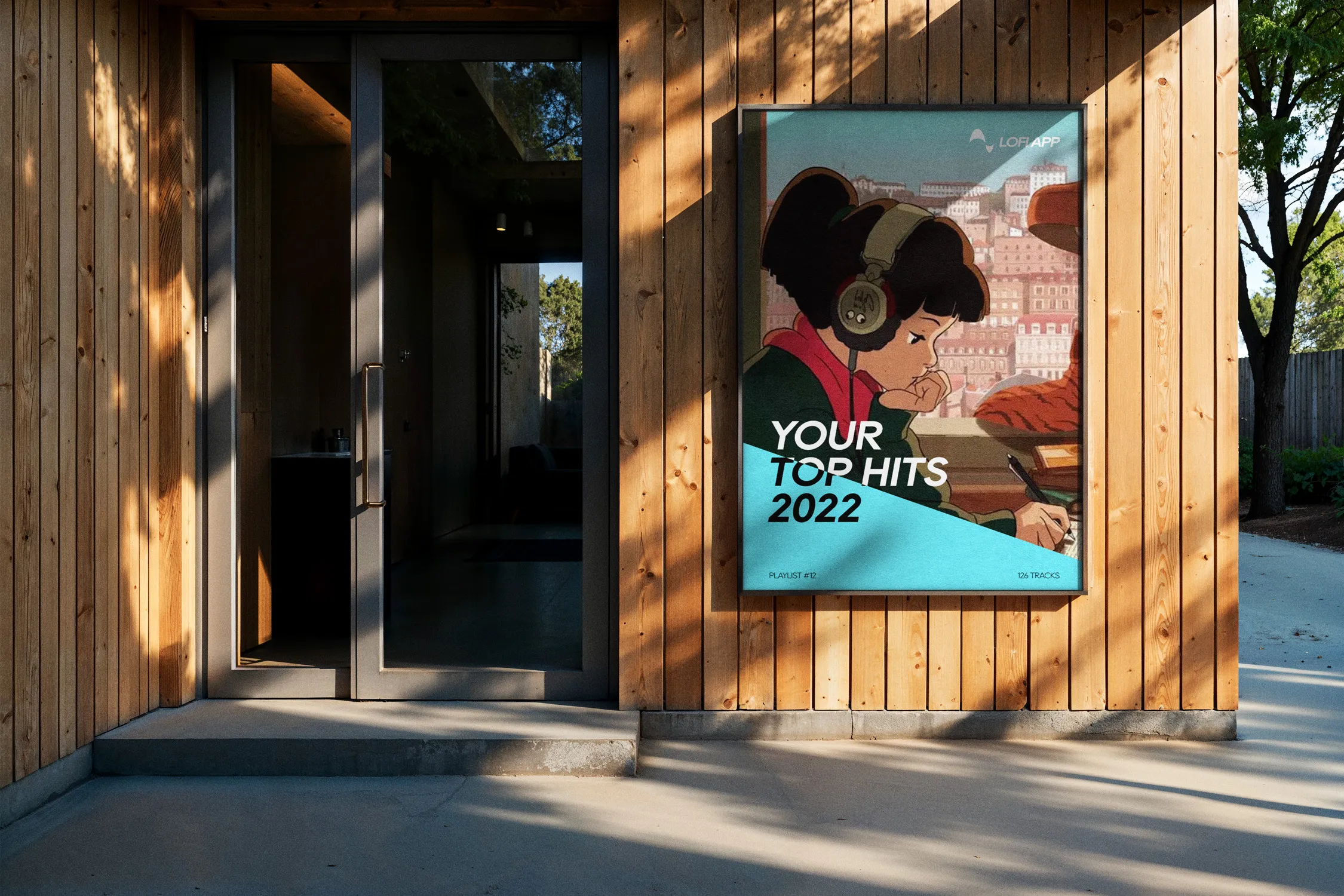
Next, I translated the visual language into a cohesive system of components, ensuring consistency across typography, colors, and imagery. Every element was designed to enhance the listening experience and make the app feel alive and immersive.


The identity evokes tranquility and focus, using soft colors, fluid layouts, and gentle visual cues that mirror the music itself.
Design choices create an approachable and welcoming interface that resonates with users of all levels, fostering a sense of comfort and ease.
Distinctive typography, subtle motion, and cohesive visual motifs give the app a recognizable personality, making it stand out in the crowded music app landscape.
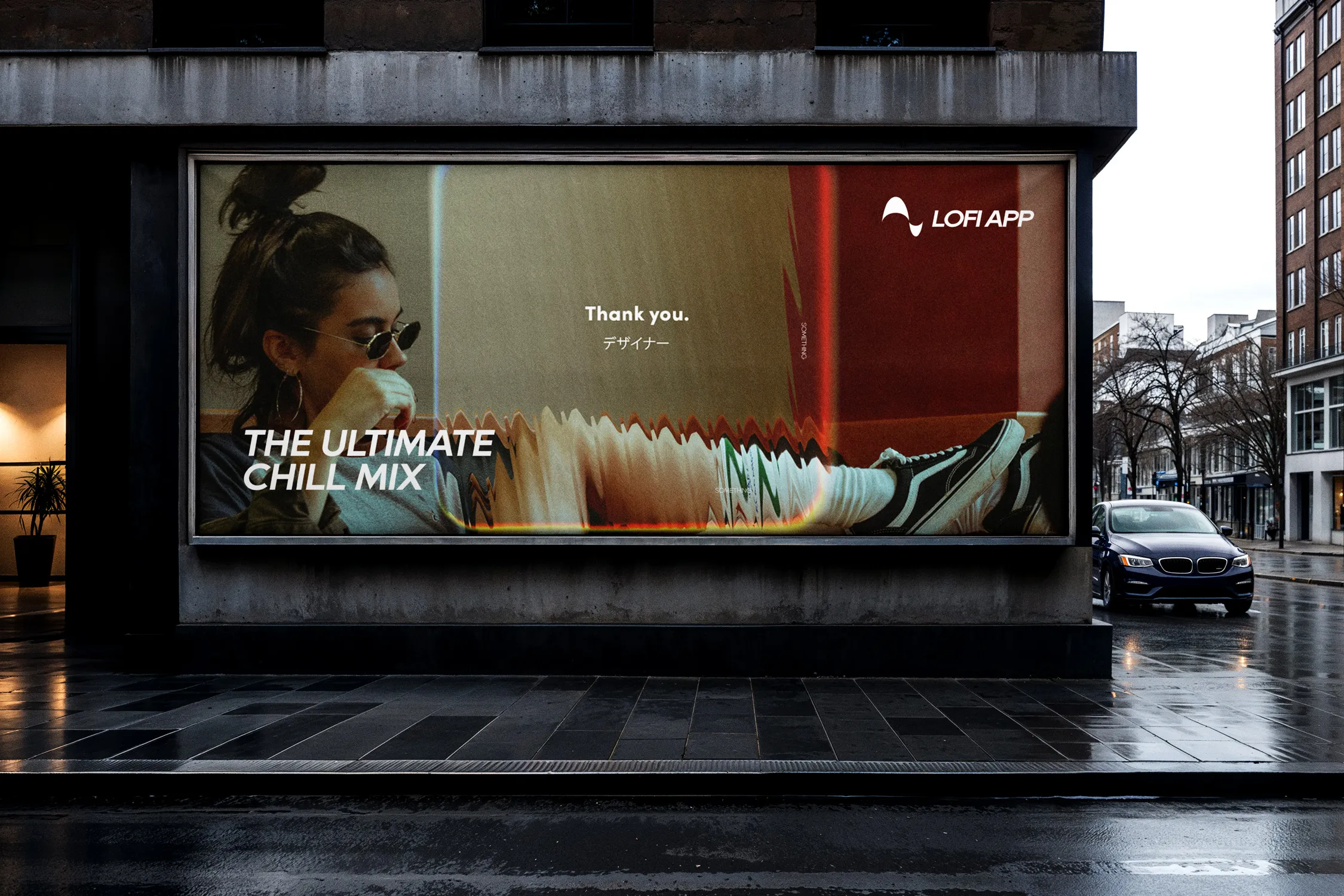
The Lo-Fi App brand emerged as a serene, inviting, and cohesive identity that enhances the user experience. It visually communicates the soothing nature of the music while providing a consistent and engaging interface across the platform.